I get it: sometimes project scope, cost, and time limitations get in the way of doing the right thing. That’s why professionals who damn-well know better take shortcuts like using inline styles. These tactics rarely save time in the long-term. This article explains why and suggests some long-term solutions to the problem of inline styles.
What Is an Inline Style?
Inline styles are CSS styling rules that are embedded directly into your HTML markup in the form of either a <style> tag or the attribute style="".the tag They’re the opposite of external style sheets, which are CSS styling rules defined in an external file that gets linked into your HTML the tag<link/>.
Both types of inline styles suck, and I’m about to tell you why.
Why Do Inline Styles Suck?
I’m of the opinion that we should avoid <style> and the style="" attribute except in the most basic situations. Why would I make such bold assertion? Because of experience, that’s why! There are many reasons that inline styles suck.
Inline Styles Defeat the Purpose of CSS: Separation of Concerns
If you’ve been in the web design business long enough, you’ll remember how hard our forefathers like Jeff Zeldman worked to pave the way for the semantic web (a pipe dream, for better or worse).
To sum it up, folks like Zeldman fought for all browsers to support some very basic features. They wanted support for XHTML: a markup language that defines the structure and meaning of the words on the page, and not so much their style. They wanted support for CSS: a language that describes how those words should look on screen, in print, and on various other devices. Their reasons?
- Web Standards. Sites were bloated with browser-specific code because no browser supported the “standards” in a standard way. An
<h1> on one site may be a different size and weight from one browser to the next.
- Accessibility. Talented designers realized that out of necessity they were using semantic tags like
<table> and <h1> <h6> to affect style and positioning, and it was making the web less accessible. Nonstandard devices such as screen readers were choking on the spaghetti code needed to make sites render on standard web browsers and devices.
- Page Weight. Marrying content to presentation meant that every page, no matter how similar it was to every other page on a site, had to download a fresh copy of all its styling. Divorcing presentation from markup makes the size of a page much smaller. A single style sheet can define the design for an entire website, and no matter how many pages a user views or how often the content changes, that style sheet need only be downloaded once.
Inline styles defeat many of the goals of semantic markup. Inline styles add to page weight and must download each time the page loads, even when the styling hasn’t changed. The style="" attribute is especially nasty: it remarries presentation and content, making it impossible for devices to style differently based on context.
And while most designers don’t give a damn about how an inline style might add a few bytes of page weight or how assistive technology might interpret their page, they probably do care about mobile.
I recently ran into a situation where dozen of pages created inside a CMS were given two-column layouts by using inline style attributes to define floats and static widths. This was fine before the mobile web was a thing and every browser could handle a 960 Grid System layout. But by defining positioning inline on dozens of pages, the developer effectively made the job of making this site mobile friendly far more difficult. The Fiddle below shows what happens to these column definitions when they appear in a 960gs page versus mobile:
Inline Styles Defeat Style Sheet Optimization
There are several methods for loading CSS more efficiently, and none of them apply to inline styles:
- Combining External Resources. The first is to combine any external CSS resources into a single file. Even though the resulting file is just as big as the sum of it’s parts, it requires only a single browser request to fetch it. On a site that loads numerous style sheets (for example, a WordPress site with a lot of plug-ins installed), the savings can be substantial. Unfortunately internal styles are rarely, if ever, optimized by these tools.
- Minifying CSS. If you’re not minifying your CSS, you probably should be. Minification is the process of running your CSS scripts through a tool that removes any unnecessary content such as comments, white space, and redundant rules. Again most CMS packages can minify your CSS for you, but only if they’re in external style sheets.
- Caching. Caching rules can be applied differently to different types of content. Once design on a website is complete the style sheets will change very infrequently, so the environment can be configured to provide the user with a fresh copy of a site’s external CSS files very infrequently, limiting the time it takes the user to download the new file and conserving costly bandwidth for both the user and your website. Unfortunately if your style rules are part of the page content, your styles will be cached the same way as the rest of the page.
Inline Styles Make Finding the Source of a Style Difficult
Consider a pretty simple example. You’ve got a website managed by a content management system and you want to change the styling on a particular page. (Let’s say it’s WordPress for this example, but it really doesn’t matter.) First you need to find out where the current styling originates so you can change it. Being familiar with the CMS you know that styles could be set by:
- The theme’s external style sheet style.css.
- An external style sheet loaded by a plug-in.
- An inline style in a
<style>...</style> block hard-coded into one of the theme’s templates such as header.php, page.php, footer.php, etc. The possibilities are as numerous as the number of templates in the theme.
- An inline style in a
<style>...</style> block hard-coded into a plug-in. The possibilities are as numerous as the number of plug-ins you have installed.
- An inline style in a
<style>...</style> block hard-coded into the content of a page in the CMS. You’d have to login and update the page content to change the styling.
- An inline style attached by a plugin like Jetpack Custom CSS.
- An inline style in a
style attribute hard-coded into one of the theme’s templates. Again, we have numerous possibilities for where it could be located.
- An inline style in a
style attribute hard-coded into a plug-in.
- An inline style in a
style attribute hard-coded into the content of a page in the CMS.
- A style dynamically assigned to an element using JavaScript.
It’s pretty obvious that locating a style’s origin gets pretty complicated when you stop stashing styling rules in a common location like style.css. Tools like Firebug and Chrome’s Developer Tools can help you determine the source of a given style. They’ll even tell you the exact line number in an external stylesheet where a style is defined, or tell you where in the HTML markup an inline style has been defined.
The key words in that statement are “in the HTML markup.” Remember 20 seconds ago when I listed all the server-side code that could be generating inline markup? Tools like Firebug can only tell you where a style is defined in the HTML markup the browser receives. They can’t tell you which server-side code generated the markup. Relying on inline markup can leads to entire hours lost searching server-side code and database content just to figure out why a certain element is bold, the wrong color, or badly positioned.
Inline Styles Solve Today’s Problem & Creates Tomorrow’s
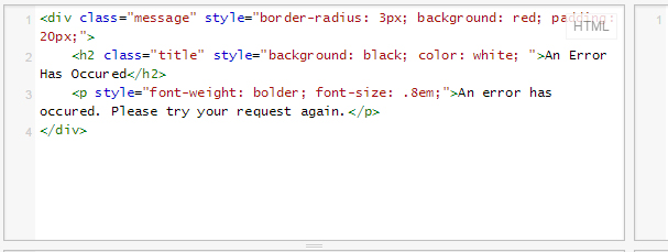
Inline styles contained in a <style>...</style> block only affect elements on the page in which they live. Styles in an style="" attribute only affect the HTML element on which they’ve been defined. So by their very nature inline styles create scenarios where copy/paste feels like the only solution, and by extension they introduce inconsistencies into your web design. Consider the code below. In the HTML markup we have a single <div/> with a class="message" and some inline styles to make it look like an error message.
We’re so thrilled with our new error message styling that we decide to use it on a few other pages! But since our styles are inline and we don’t want to waste time editing what already works and creating an external style sheet, we copy & paste what we already have.
Months later we realize that our background color isn’t exactly easy on the eyes and want to change it. First of all months have past and we may not even remember writing this code, and must track down where the styles are defined. Second, we realize because of our up-front laziness we now have to change it in several different places, and if we miss even one, our message styling won’t be consistent throughout the site. At this point we realize that it would have been far easier and far more consistent to just externalize our style in the first place. In the example below I’ve moved the styles to an external style sheet, where changes only need to be made once:
Why Do Developers Use Inline Styles?
All the points I’ve made in this article are pretty well-known. So why do seasoned developers that ought to know better still keep using inline styles?
Excuse 1: Project Constraints
If you’ve been given a common task like changing the layout or the fonts on a single item or a single page, an inline style might feel like the best solution to that specific problem. The project scope might be “made this heading bolder” or “switch the Products Page two a two-column layout”, not “create a reusable style for page headers” or “create a responsive two-column layout for page Y.” Not only are you not getting paid to think about how your solution might effect the site in the future, your work culture might completely disincentivize doing things the right way by rewarding quick, billable solutions, no matter how hacky or void of forethought they may be.
Explain to your boss why you should take the time to solve the problem the right way, and do it. Unless you’re working with an inferior CMS that gets in the way of getting your work done, it shouldn’t take much longer than adding the CSS inline.
Excuse 2: Technical Constraints
Some content management systems don’t provide a way to target a specific piece of content with CSS other than including the CSS in the content itself. This was true in old versions of WordPress, and the problem still exists in themes that don’t follow the practice of calling body_class() in their header templates.
Whether you’re working on a framework of your own design or an open source CMS, your workflow should provide a way to target specific pieces of content, and a common location for stashing CSS. If it doesn’t, your workflow should probably be improved. Here are two examples, one off-the-shelf and one custom:
- In WordPress styling is stashed in the current template’s style.css file. Plug-ins should (but don’t always) import styles from their own style sheets. Each page you create provides a body class that allows you to target specific content from within the external style sheets, eliminating the need for in-line CSS.
- In my employer’s in-house CMS, we stash CSS in /styles/custom.css. Each piece of content stored in the CMS has a unique id that is used to set a body class, which allows you to target specific content from custom.css, eliminating the need for in-line CSS.
Summary
Last Friday my entire day was consumed by fixing problems caused by other people’s erratic use of CSS. A perfectly good mobile template was blasted to bits by inline styles coded into page content saved in their live CMS. While I’m sure there are some situations where an inline style might be the best solution, I have yet to run into any of them. Please style responsibly.